Increase the page width of the WordPress Twenty Sixteen theme.
One issue I've found with the built-in WordPress themes (especially the Twenty Sixteen theme) is that when using images in a post they are not aligned correctly on the page.
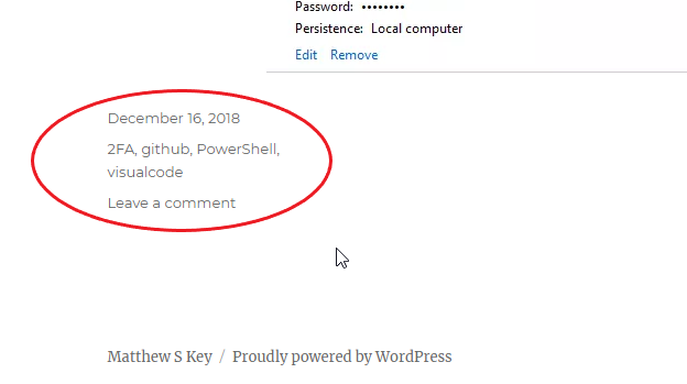
After firing up Chrome development tools and checking out the elements on the page it is clear that the main culprit for this is the post comment/date stamp element taking up a big part for the left hand of the page, as shown below:

This can easily be fixed by overriding one CSS element.
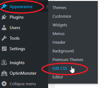
To do this, logon to your site’s WordPress, click on ‘Appearance’, then ‘Edit CSS’.
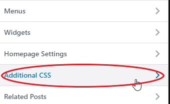
Next, click on ‘Additional CSS’
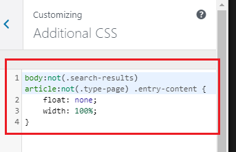
Add the following snippet of CSS into the text box
[cc lang=”css” escaped=”true” line_numbers=”true” nowrap=”false”] body:not(.search-results) article:not(.type-page) .entry-content { float: none; width: 100%;} [/cc]
It should appear as shown below:
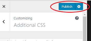
Finally click on ‘Publish’
Any future posts should appear with the comment/time stamp elements at the bottom of the page and the width of the post should now increase.
